I was recently asked to be the 'Voice of the Week' for a social networking site called 'Tondo Social'. It is a great platform for discussion regarding the Arts. There is a mix of artists, photographers, writers, collectors, enthusiasts of art in general. I thought I would include one of the seven, short articles I contributed here. The idea was to share and generate discussion.
What makes someone an artist?
I've been thinking about this topic for days and I am still not sure I have a definitive answer. I have had other career paths that were easier to claim, I have been a jewelry maker, an actor (not a very good one) , a model and an assistant at a film production company, all titles I was comfortable claiming when asked what I did for a living but when it came to art it took a long time to say I am an artist without the words choking in my throat.
I tried saying I was a painter, more comfortable because painting is the medium of expression that chose me, it felt more honest than artist which implied so much more than creating paintings. I had painter on my business card for years but people kept thinking I painted houses so, I finally put artist under my name, but it took a lot longer to own.
I used to think artist was a title was reserved for those who studied fine art, who held an MFA, as though a qualification was the required validation. I no longer believe that.
What was the tipping point?
For a while I suppose sales had something to do with a sense of validity, making art that someone else wanted enough to part with cash to acquire bolstered my confidence and made me feel more worthy of the title, but years on I no longer think that is the qualifier either.
In my opinion, an artist can come from any profession not just the arts, a dentist with a passion for dentistry and perfect pearly white's can be an artist over a dentist who does his 9-5 to pay the bills.
I think of being an artist is a state of mind.
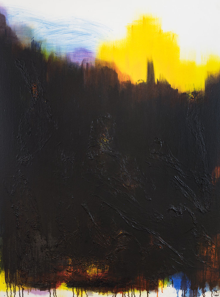
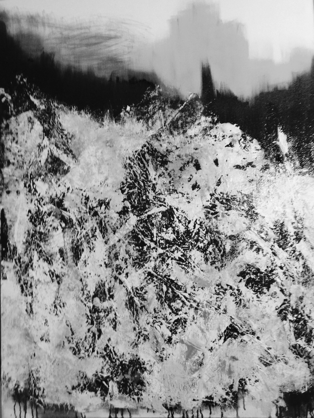
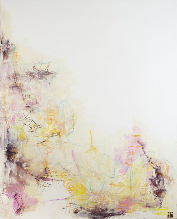
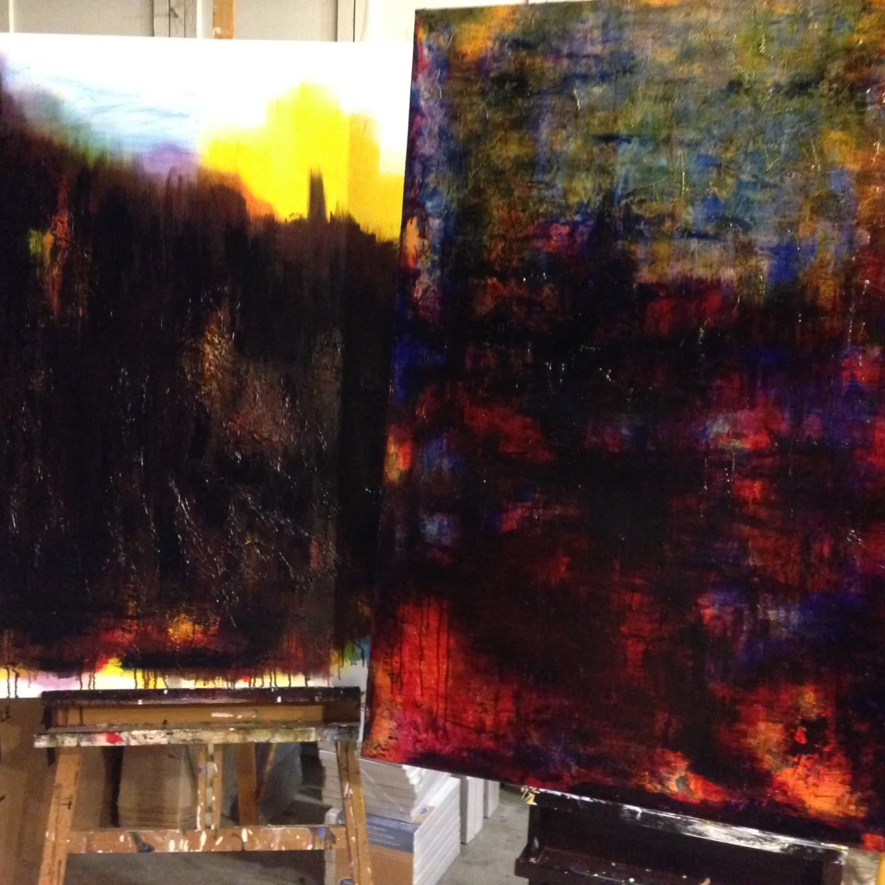
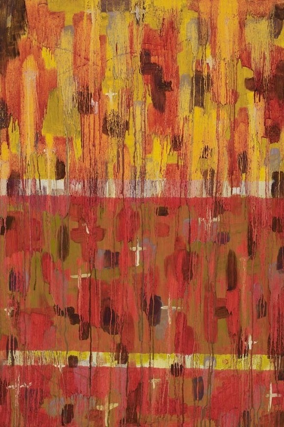
It is a commitment to fulfilling ones need to create regardless of sales or outside validation. It is a way of seeing everyday life, searching to find the answers to the questions that arise through a natural, child like curiosity of everything that surrounds you, seen and unseen. It is an insatiable desire to explore, a draw to get into that flow where time no longer exists and the color blue can provide a means to knowing yourself better. It s fronting up on a daily basis in the studio despite not knowing what comes next. It is feeling wealthy when you have paint supplies over a large bank account. It is passion.
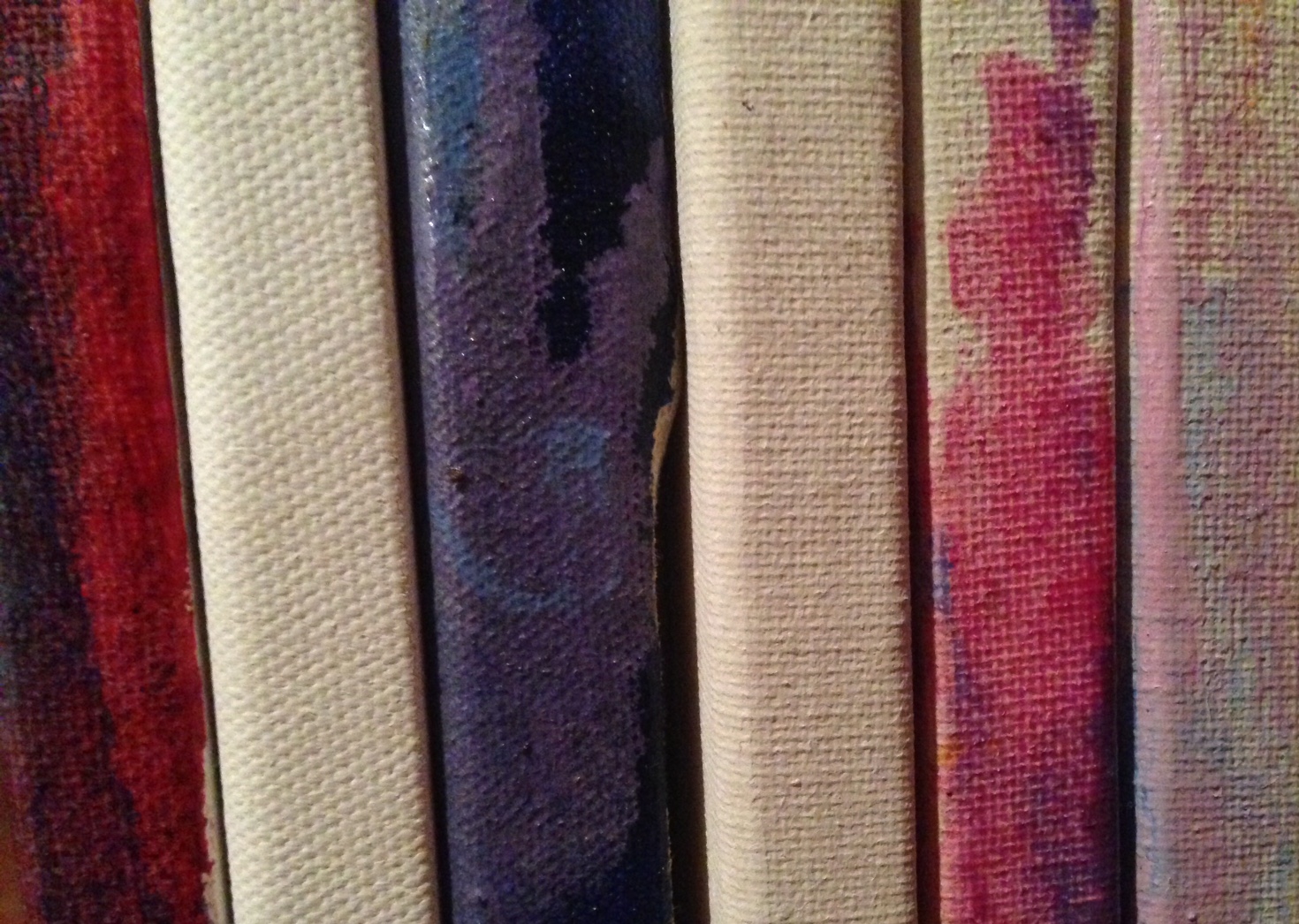
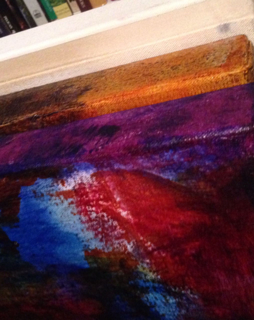
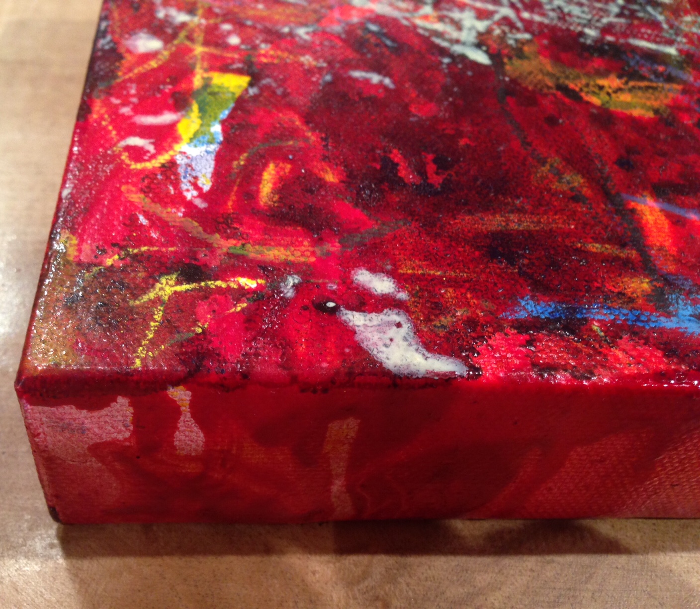
I explore my inner being by making marks and spreading paint on the canvas. I delight in the way colors unite when mixed and I wait patiently while gravity works its magic creating drips and rivulets form and create their own beauty in front of my eyes. I am truly so excited at such times that I can feel the cells of my body vibrate at a higher frequency. Sometimes, I may be so overwhelmed at the enormity of what is happening in front of me that I have palpitations. My chemistry changes, for the better. I feel full of possibility and wonder and that feeling stays with me when I leave the studio and head back to the 'real world', at least for a while, then I may need to go back to refuel.
I often look at debris on the studio floor and see mixed media pieces. I cut up my parchment palette papers to make a mosaic work recently as I loved the notion that that piece was made from the discards of making my paintings and became a record of the color palette of the painting as much as literally from the palette itself. That notion amused me for days.
What are your thoughts on what constitutes being able to identify oneself as an artist- In any field?