
Through journaling I have found another portal to self discovery.
I am using art making as the medium to evoke memories of my own and unlock memories stored in my DNA because there are family members no longer on this Earth who's stories remain a mystery, as there was much they would not speak of while here. They are survivors of WWII.
My Grandparents had the courage to travel with a small child (who later became my Mother) across Europe, from The Czech Republic to Italy to board a ship bound for a foreign country (Australia) in the hopes of creating a new life.
They, along with many others, managed against all hardship to do exactly that. I am eternally grateful for the courage and faith they had in their ability and future, assuring mine.
This spread is a way for me to connect more fully to their journey. I am surprised by the depth of emotion I have felt using this process of art journaling.
The act of collaging old photographs, building and excavating layers of paint, pastel, ink and graphite, mirror the emotional digging, revealing and concealing so much more than I anticipated. It is a truly rewarding process and one that I will use as a means of expression, alongside of my daily painting practice.
Online journaling course.

new arrivals...
I am currently enrolled in an on-line art journaling course. It has had my full attention for the past 3 weeks. I have been absorbed in translating my painting process into the journal pages using different media. Oils take too long to dry to achieve the very quick results I need to work at the pace I am.
Acrylic, collage, pastel, and ink are among the materials I have been playing with and it really is play.
Each step has been a new path to explore, from the inner realms to the physical art creation. The two mirror one another as they do in creative flow but it has been a refresh button to abandon my known techniques and act on impulse alone and in the spirit of discovery without any other purpose. It is very freeing.
The pages (double spread) have been given themes, all originating from a master theme of getting to know yourself. I am working through my heritage in various forms and formats.
There's a truly rewarding dialogue that occurs along side of the creative process . Each mark, tear or paste a metaphor, something shifts in recognition inside.
This is my 3rd spread. 'Siblings'.
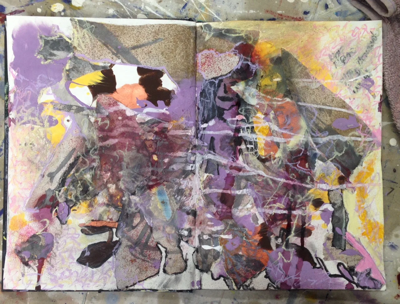
The most exciting moment is also the most anxious. Just before making your first mark.
Once you have begun, it is exhilarating following each movement and inspiration to the next.

By no means have I stopped my regular painting process but I have taken a little sabbatical to dive into the course instruction and pay attention to what comes next. It is already informing me of new directions.
'A Rose by any other name'
I am deeply attracted to tiles, blocks and multiples in painting. I just love the concept of many small parts that contribute to the whole. A metaphor for life really, we can appreciate the detail while still seeing the big picture.
While working on my larger paintings, I usually have a smaller, multiple work on the go at the same time. I love designing the multiples to read as one and yet be able to hang individually.
I am especially thrilled when a client purchases a set, as I create I do intend the work to be hung as one but understand available space and finance have a place when purchasing a work.
'A Rose by any other name' has been collected in it's entirety, consisting of 9 blocks @ 6"x 6".
I hope my new collector is inspired everyday.
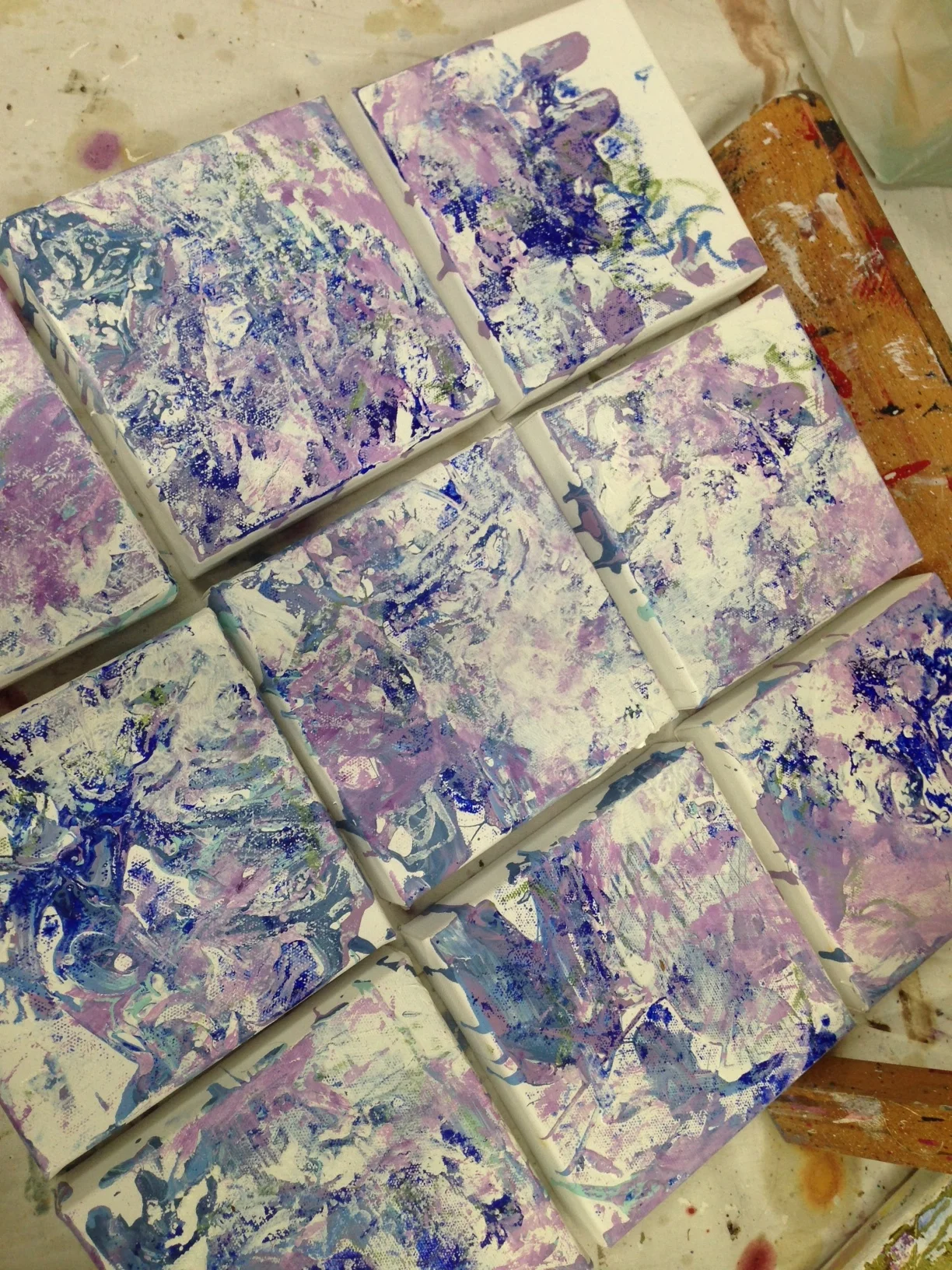
Pastels and Neons...in the Studio
I have been continuing my 10" x 8" works and loving the lighter palette....I have never combined pastels and neons before but really like how it's working out! I will paint washes of oil and glaze over these and share when complete!

'Go forth and be kind'
I have been finding my personal balance in painting.
Restoring connection to source energy, as dialogue occurs between the canvas and the paint.
'Go forth and be kind' it says.
18" x 36" Oil/Canvas
2016
Detail: (This is only a detail picture not the whole painting.)

Inspiration.
I find I wait until my paint clothes are on and I am in the studio and ready to work to open to the inspiration of what action to take.
I have found lately my inspiration for what color to apply next has had an interesting correlation to the nail varnish color I am wearing on the day.

It didn't occur to me until I had posted a couple of photo's on social media over the course of a couple of weeks, that this is what was happening.
I have no preference for how I am inspired, intuition has always been my guide for what color or technique I will apply in any given session. Lately when asking my higher self 'what next' my eyes have found the answer right in front of me...in my varnish!
'Abstract Love' is on it's way to Black Swan Arts in the UK.

I heard about the '1000 Postcards Exhibition' Black Swan Arts (U.K) was holding to raise money to help refurbish the historic Round Tower as an educational centre and thought I would lend my support. Sharing my work is definitely one of my favorite ways to contribute to charitable organizations.
What I didn't know at the time of creating is the Gallery is in Frome, Somerset, which is very close to Stonehenge.
I have been thinking about Stonehenge and other such energetic power points across the globe lately, wondering if being there and adding ones own energy of love at such sites could help the grid all over.
I may not be even close to getting there right now but took great joy in realizing this connection when writing the envelope for my contribution this morning.
Artworks seem to know where they are meant to be placed. I am so pleased the piece I chose for this exhibition is called 'Abstract Love' it seems even more fitting now.
Wishing the team at Black Swan Arts a successful exhibition and kudos on the idea of using art to raise funds for education!
My latest commission- turning 'Sunrise on the Mountain' into 'Awakening'.
I've been busy this month with a commission. It's been an interesting process. Once again, I have learnt many things through the process of collaborating.
There have definitely been many stages thoughout the whole push/pull relationship with the canvas and palette changes, along with an entirely new midsection, in the style of the 'Thick series' that have challenged me but as I've pushed through it always rewarded. The work began as 'Sunrise on the Mountain' a 36" x 48" painting from the Weave Series.
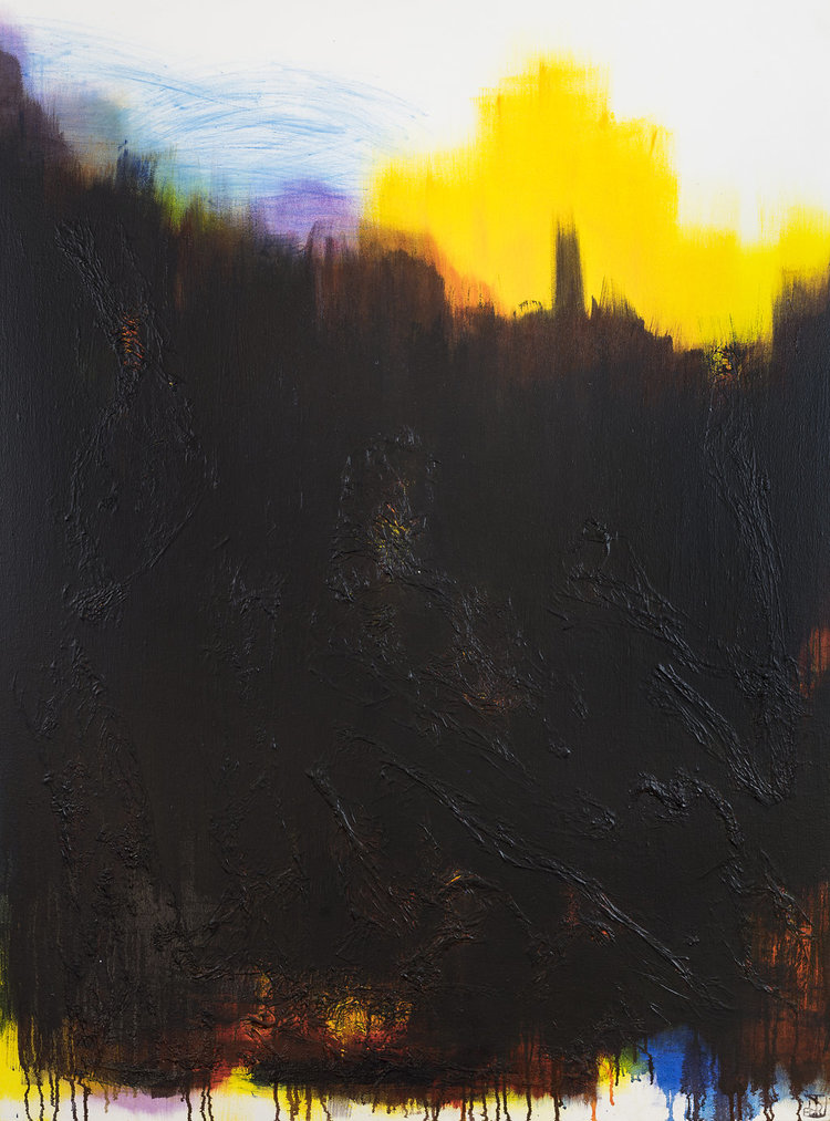
After discussing which series on my website my collector responded to and in what way, I decided the best way to meet the request was to begin with a painting, from one of the preferred series already complete.
I then factored in the extra detail and contrast using the colors already present in the undercoat/painting and created texture with a palette knife of Titanium White.
My client explained he is actually color blind, so I photographed it with the black and white filter to see if I could see the work differently.
It was very interesting, they way it highlighted the area's of contrast so easily and enabled me to visualize more clearly the area's to solidify. He wanted the windows to the darker ground visible in parts and a lighter 'Spring' feel to the highlights included in the more textured top application.
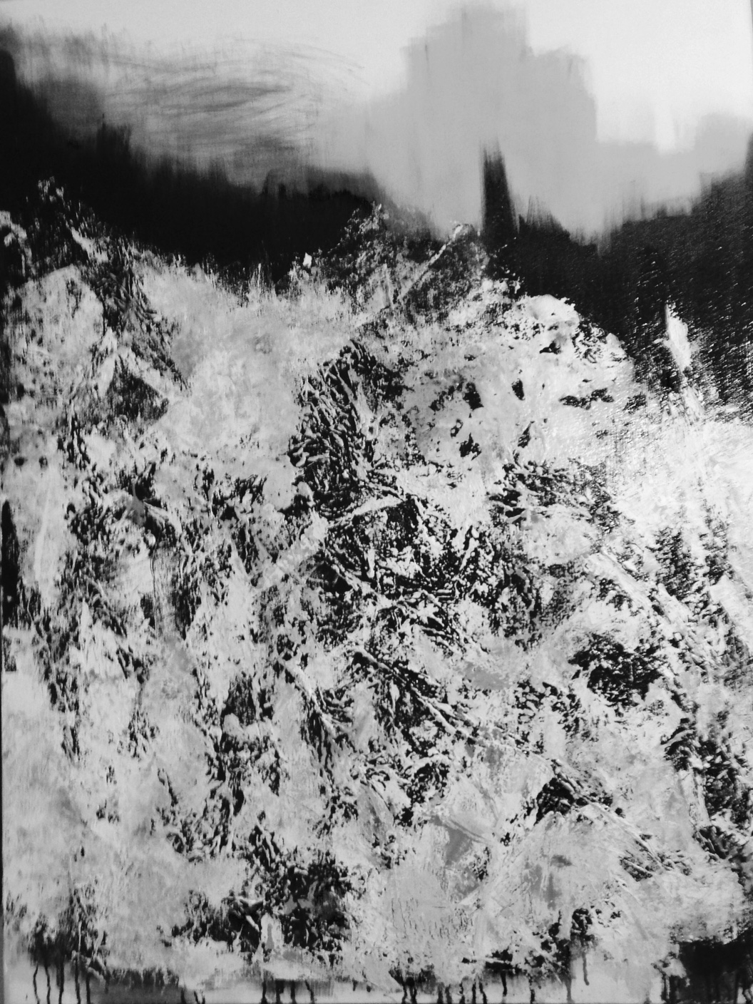
Black and White image of the painting in progress to share with my client who is partially colorblind.
At present the entire top third is painted Titanium white with hints of a glow of the palette that lies beneath. I will always know it is there and feel it's contribution but how much of that glow will remain to be seen is still unknown as yet.
At a certain point it will just be right, even though some stages don't seem to make much sense on their own. It is always the whole with a painting. Each layer contributing in ways unplanned and building on from there to create a work that at some point just cries finished, complete. and you know it.
This work is about renewal and the windows through to the under layer painting are a salute to past, the fabric that goes into the weave. Although, with paintings it often feels as though the future is painting the now. The layers know why they need to be expressed in terms of the final outcome. I just have to trust.
Finally, the finished painting. My client signed off on it today and I am preparing her for shipping.
I am excited to be able to contribute to the new environment my client is establishing, for the beginning of a new chapter in his life. What an honor it is to journey in collaboration with another. Co-creating at it's best!
(Unfortunately there is no time to photograph this work professionally so here is an iphone picture to share.)

'Awakening' 36"x48" Oil on Canvas 2016
Tiny Works Exhibition @ ActivistartistA Gallery in Boynton Beach, Florida.
My Tiny Talisman have found another size appropriate show to participate in at the ActivistartistA Gallery in Boynton Beach, Florida.
The show is titled Tiny Works and tiny they are but it is interesting to note small work still carries a vibrational imprint that is large, particularly when there are multiple works hung together!
Kudos to Rolando Chang Barrero for organizing another great community event!
Tiny Talisman I

Tiny Talisman II

Twitter Exhibit Entry: 'Rebirth'
http://uricmpr.com/site/twitterartexhibit.org
I have been painting Tiny Talisman for the better part of a year,
The idea was in part dictated by available space and a desire to continue in some way, with the tiles format of paintings fitting in together, parts to the whole. I've held a fascination, since studying Latvian Artist, Immants Tiller in my early painting years for tiles and canvas paper that joins, pages telling a story.
The original idea stemmed from a clients request to have a piece of art she could carry around in her purse for the energy it imbued to travel with her, hence the title Tiny Talisman.
Since making these 2.5" x 3.5" paintings on canvas card, I have explored a number of themes with them. In the process of their completion and during the assemblage of the multi card projects, (the mixed media 10"x8"s of 2016) I have found a renewed sense of play.
At times I painted them into the canvas at other times I removed them leaving a space where they were once. They have become an index of the palettes used in creating my larger works along the way.
They are in progress, all around the studio most of the time. I use paint left on the palette after a studio session and apply a certain stamping to the cards with it. The layers build over weeks and even months until they feels complete.
I mainly print 2.5"x3.5"'s but occasionally will use a larger size of canvas card to begin. This entry to the Twitter Art Exhibit , titled 'Rebirth' is postcard size.
I have entered a couple of Exhibitions with my smaller works in the last month. It's been great to see these little works make a difference somewhere, regardless of size.
The proceeds of the sale of work in TwitterArtExhibit go to Foster Pride NYC. It's nice to be part of something that can make a difference. :)
There is so much good work to look at or purchase too!
My painting: 'Rebirth' 2016
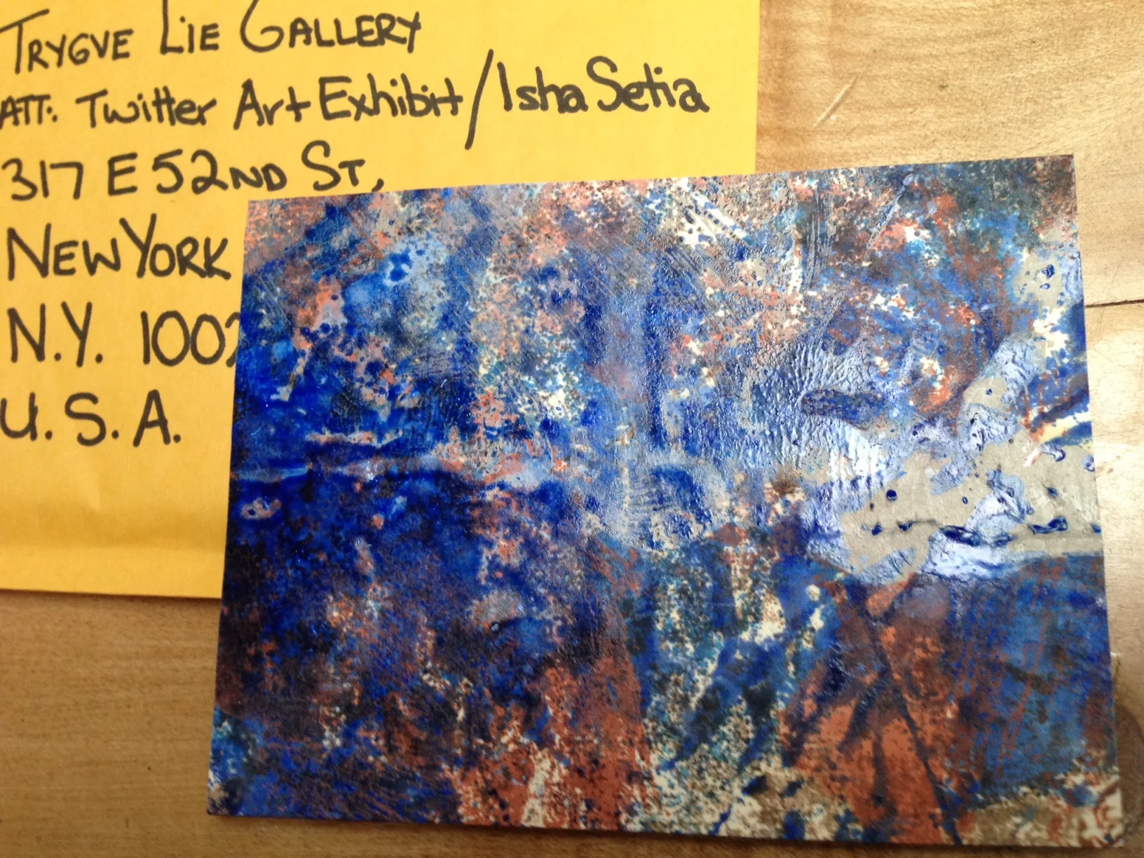
Thanks Twitter for organizing the TwitterArtExhibition!
Pantone: Colors of the year - Rose Quartz and Tranquility.
Pantone has chosen Rose Quartz and a pale blue they call Tranquility as the colors of 2016!
This is the first time they have named two colors together.
I like the idea it reflects a balancing of masculine and feminine energies. I believe/hope that is indicative of what is happening in the world. Less of a separation between the sexes and a balancing of two equally essential parts to the whole that we are.
I have noticed over the years, the colors Pantone choose each year have usually been factoring in my work for the 6 months or so previous. It happened with Marsala in 2015 ( also in the Fog Series) and Radiant Orchid in 2014. In 2009 I showed a series at 'Chapel of Chapel Gallery' in Melbourne , Australia which consisted of Turquoise and Magenta predominantly. Turquoise was the Pantone color in 2010!
It makes me ponder the universal nature of energy and thought. These attractions floating around and people the world over picking up on the same frequencies. I love it.
My 'Fog Series' definitely resonate with their color chart for this year.
I am not sure if I will continue this palette as I am guided intuitively and do not plan in advance but it will be interesting to see if I use new colors and whether or not they become the Pantone colors for 2017!
https://www.pantone.com/color-of-the-year-2016
I love Rose Quartz and the energetic message from it. It is definitely a good choice not only for artists, designers and those in fashion but as an emotional yardstick for the year ahead.
Below is a link to the qualities imbued in the Rose Quartz crystal.
I hope this IS the color of the year...we need it!
http://www.crystalvaults.com/crystal-encyclopedia/rose-quartz
I collect Crystals and enjoy them in my work and living space. I like their beauty and their frequencies. Here's a photo of my rose Quartz. There is an indentation that fits my hand when placed upon it perfectly! It feels soothing to hold.

Here's "Cheers" to more mindfulness and compassion, self love and integration of yin and yang for us all!
My Heart!
Recently, I had an echo cardiogram test on my heart. I found the whole process fascinating. How incredible to be able to see inside the organ that keeps you alive!
It was truly beautiful and when I came home I knew I had to paint the experience.
This painting stands alone. It is not part of a series and I will keep it for myself but thought I would share it with you.

'My Heart'
18" x 36"
Acrylic on canvas 2015
The colors are the colors that show up on the sonar...red, blue and yellow. The primaries.
I had a giggle as metaphorically that made sense to me.
I also think of red as symbolic for the masculine/active principle in life, and blue for the feminine/ receptive.
Yellow symbolizes energy and life to me so, I found these colors very apt.
There was a nice balance between the red and the blue with highlighted accents of yellow.
(The red and blue pulsed with blood flow and yellow sparked up with electrical activity.)
It feels to be a well balanced heart.
My results were good and my heart is happy!
I hope you like it!
'New Beginnings' Exhibition. Manhattan Arts International
I am thrilled to have 'Spring in Fog III' from the Triptych, 'Spring in Fog' - 'Fog Series' 2015 included in the Manhattan Arts International Exhibition titled 'New Beginnings'
The theme fitted my series very well as it was a new series, in a new place of residence, in a new state and a new country!
(Well, I guess after 5 years in the States, I can't really call it a new country anymore, but California is vastly different from Texas, so it still feels very new!)
Here is the link to the page on the Exhibition.
http://www.manhattanarts.com/new-beginnings-exhibition/
Winter of 2014: New Beginnings. We had just moved to the Bay Area, thus my first experience of fog. I went within, painting only for myself and the release it provided. I regained an innocence. Using muted color in veils, scraping, layering, revealing and concealing, much the way fog does.

Spring Fog I, oil and pastel on canvas, 32" x 40"

Spring Fog II, oil and pastel on canvas, 32" x 40"
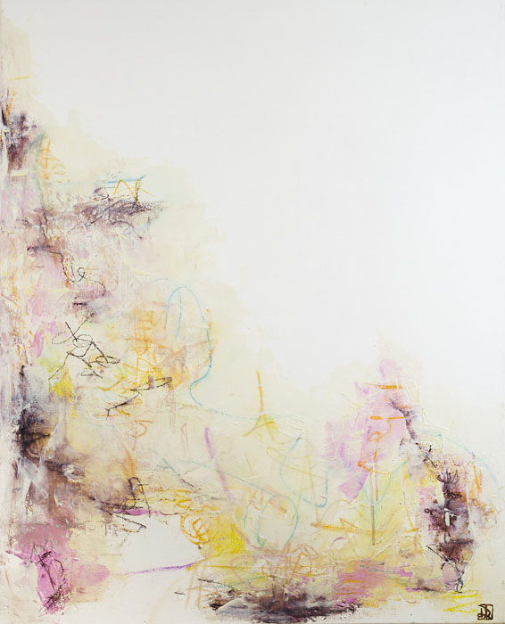
Spring Fog III, oil and pastel on canvas, 32" x 40"
Thanks to Renee Phillips from Manhattan Arts International for the great opportunity to show with a fine calibre of artists!
Drying room only!

Often times I am working on a number of paintings at once. This is due to the drying time required between layers of Oil paint.
In warmer weather it can dry in a day or two with light layers but in winter it can be a week or more, depending on how textured the work is. Heavily textured work can take months to dry but most of my work is created with thin veils of color.
These are some 8" x 10" paintings I have been working on over the past couple of months. I am enjoying the smaller size. It requires a different way of working and the gestures are tighter than with a large canvas but rewarding in their own way. I find myself really enjoying detail.
I am overlaying printing with mark making in oil pastel and oil stick (thicker texture) and applying layers of glaze and pigment. These smaller works are reminiscent of the work I create in my journal, which is just for fun.
Soon, there will be enough of them to justify booking my photographer for another session! I'll then add those photographs to the 'Small works' Gallery section.
There is not a lot of room in the studio right now as there are works on easels and works on the floor but I always find room to create somehow!

Edges and how they fit in to the picture...so to speak!
I've come to appreciate the edge of the canvas, in terms of it’s size and its effect on a viewer’s relationship with the painting.
I thought it might be interesting to share some of those thoughts with you.
3/4 " edges serve 8" x10", 16"x 20",multiples and small works by creating a physical balance; not emphasizing but integrating them.
Often sold as multiples, these smaller works can be simply framed and hung together in a form or a cluster as easily as they hang individually..
They can also be incorporated into a single frame as multiples, that read as one framed work.
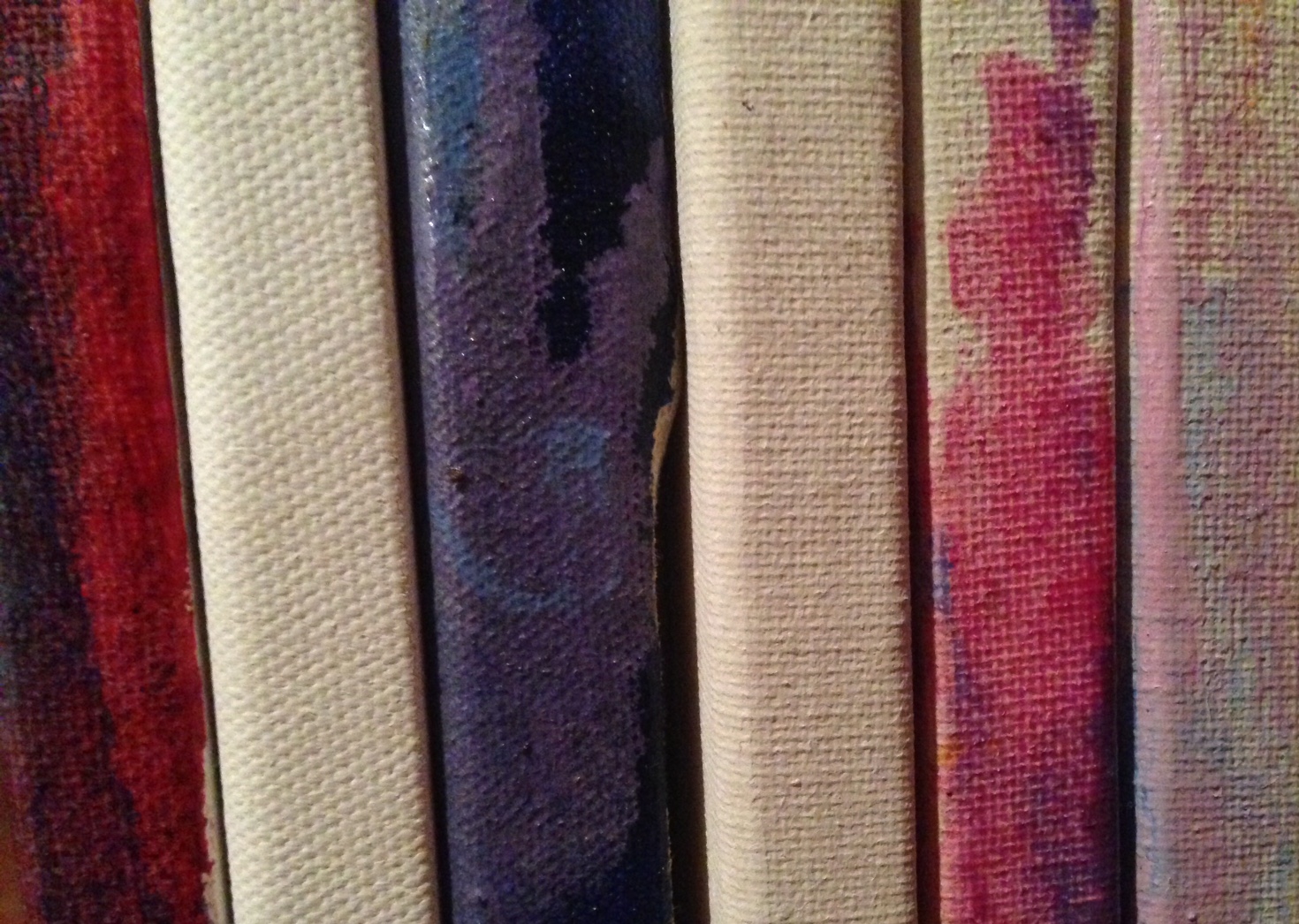
I think edges can be very elegant and act as a visual unwind of the layers in the painting .
They also create a 3 dimensional aspect to a painting, where a frame tends to emphasize the flat picture plane.
I do like a large work to have a deeper frame, fulfilling its proportion in a 3D balance of the painting.
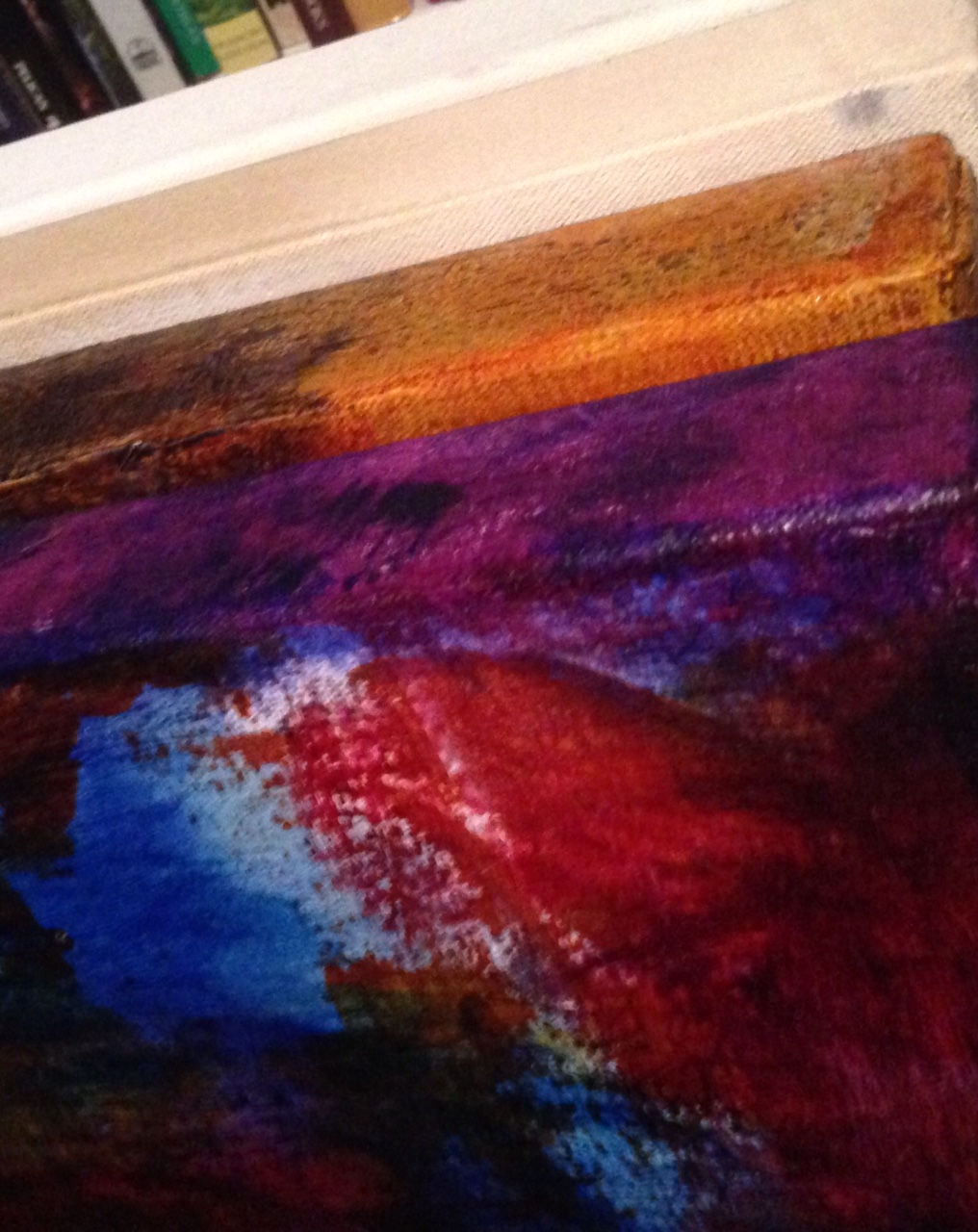
1/ 3/8” edging has more of a presence to incorporate into the painting. It flows naturally in my larger 36" x 48" works,
but when used with a 6" x 6" canvas, it can make the painting feel more like an object.
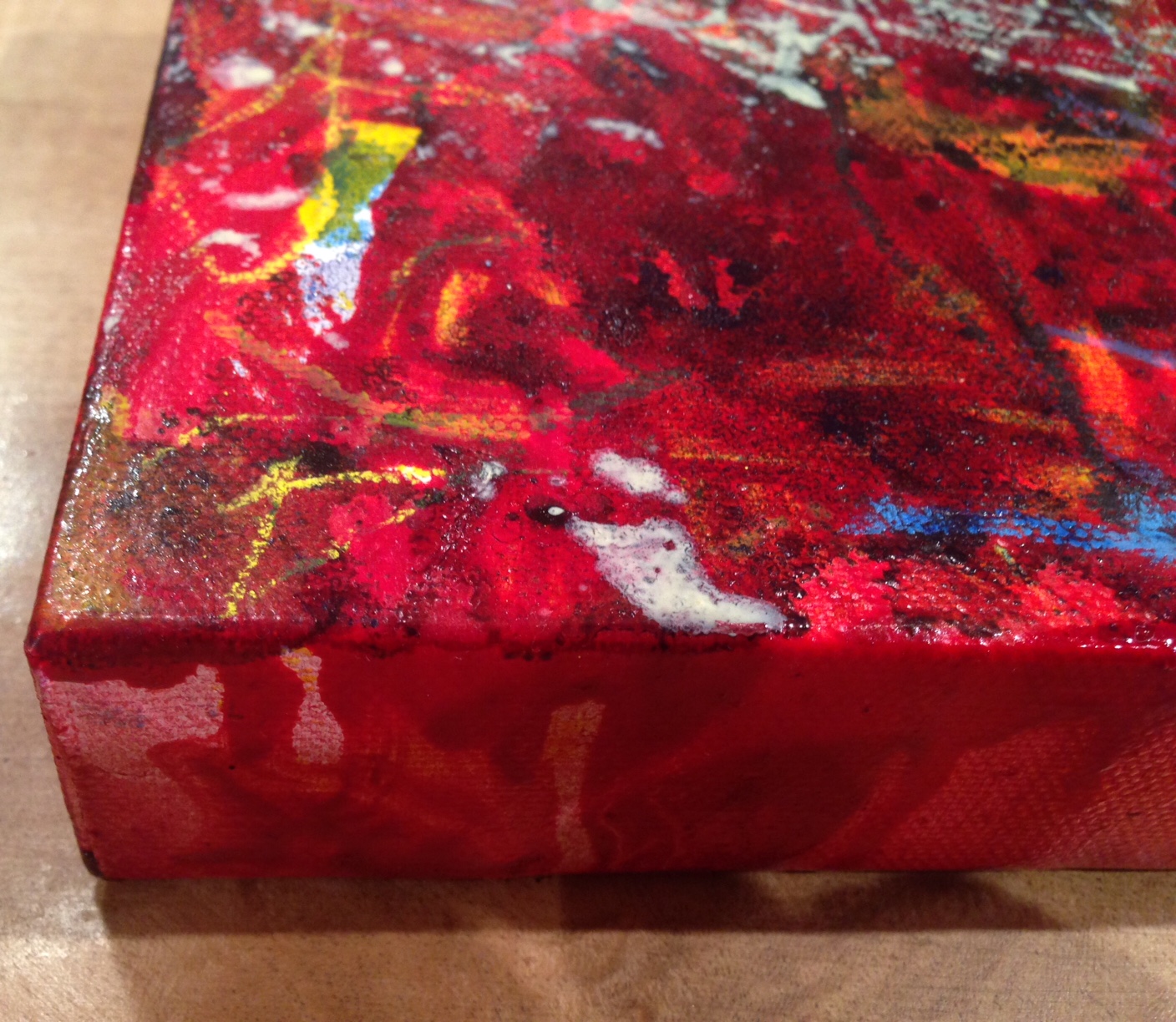
I don't much like frames unless simple and not distracting, although, a simple boarder in a small paper work can work well.

(matt black floater frame)

I never get tired of watching paint dry!
It's hard not to get lost in a painting as your waiting for it to dry. I can get mesmerized by the smallest detail! One section leads to another, each inviting to look further, deeper into the galaxy of color.
Homage to Helen
I have been learning a little about Helen Frankenthaler and her work recently and as part of the understanding of her staining process, have had a play in the studio with the process.
I love learning about other artists and their process although I rarely imitate others work as my own process is intuitive and that is what I love most about painting. The idea of preplanning spoils it for me.
It is fun to play around with ideas and techniques though and so I had an explore with Helen's staining process, although I used a gesso primed canvas instead of raw which contained the bleed somewhat.
It is so freeing to 'throw down' paint and see where it leads you. I thought I would share the result! Hope you like it.
(This is a quick Iphone snap, but I will photograph it properly for the Gallery section.)

'Homage to Helen'
Oil and Glaze on Canvas
18" x 36"
2015
Tiny Talisman.

I have been unwell for the past month with a flu that wiped me off my feet. I am well on the road to recovery now and grateful to be back in the studio.
I managed to paint some days but missed my daily practice enormously. I couldn't move up and down with out full vertigo due to my sinuses being affected. This meant it was too painful to work on my larger canvases.
Out of necessity to express, I got some Artist Trading Cards (canvas paper) and began to play at the table with creating Tiny Talisman. They are 2.5" x 3.5" and in my opinion, pack a punch in energetic terms!
It is interesting when changing canvas size. It requires a different way of working, small movements, different brushes and tools and as I generally work on the floor or at an easel, working at a table was new to me too.
I chose to mono print layers so each piece is unique, and continued the theme of multiples in these smaller works. I like the way they read together and yet can stand alone.
All in all, I think these Tiny Talisman's serve as a reminder that every cloud has a silver lining, if one is prepared to think outside of the box!
I am going to continue with various sized works on Canvas Card and see where it leads. I am also heading back to the studio to finish off some of my larger works, as I do miss the wider, gestural more physical engagement of those but these have been fun to explore. I hope you like them.
It's all peachy....

July is over, which brings an audible "sigh" from me.
It was a big 'push and pull' you month. Lots of unexpected events that took time and time itself seemed to operate on and off, warping at light speed and then feelingl fluid and dense..
My paintings have reflected it back to me. I've moved between thick and sculptural to fine and delicate layering all month., some happening quickly others very slowly.
Various series have popped up for a new work to be made, which resulted in nearly one painting in every series being created at the same time. Insanity!
That is how it goes sometimes.
I paint daily and family life is not 'disrupted' per se by my nightly hours. My husband has similar requirements for his creative work. we enjoy that of each other, but painting for long periods in succession isn't a regular possibility right now. There are too many other things that I do in the daylight hours, to support the evening's creative output, to be done. So it is exciting and unusual.
I'm fortunate this time has been coinciding with the renewal of an exploration in the Ab/Ex field - 'NYSchool painters' in our MoMA Alumni Group. It's inspiring and motivating to share such beauty and discuss techniques. I love exchange, good exchange and I love great art!
I worked hard in the studio and in my personal sphere. Frankly, I have been looking forward to painting without other commitments for some time!
So, here's to experimenting over the next few days before I get ready to have photographs taken of 2015's work update. I'll post those mid August. Thanks Terry Schmidbauer!
ART- Vibration with intent.

Homage to Rothko / Oil on Canvas / 24" x 30" / 2012
Today I read an inspiring quote from Kandinsky.
I shared it on social media and had some interesting response. I started thinking about the different ways people respond to art and how it makes them feel. Why do some people feel it and others only respond to what they are told about it, or suggestions on how they are expected to respond to it?
I have always been a feeler, but i do like a good back story on the artistic process.
Sometimes it helps me to view the work with a fresh pair of eyes but isn't necessary in terms of how I feel about a work, that's usually instant.
The quote was in reference to spirituality in art, not spiritual art but the spirit 'in' art and how it fine tunes our being when exposed to it.
I believe this to be true. I am often deeply moved and sometimes changed by a work of art.
Most of the Abstract Expressionists from the New York School effect me profoundly.
Rothko has had me in tears on a number of occasions when I've sat in front of his work in a Museum. At the NGV ('Untitled Red') , MoMA ('No 10'), SAM (Orange on Red), DMA , and the Guggenheim., mostly his latter work. (Although, I do like his early abstracts, the earlier figurative's don't hook me in.)
Barnett Newman's Zip Painting 'Onement I' had me spell bound at MoMA. I had seen reproductions in books and felt only admiration he was so sure of his path but in person, I felt attracted to it in a very powerful way.
I've felt a deep waves run through my being from the proximity and engagement with such work.
I feel blessed to be able to receive a resonance like that. It changes your chemistry, which in turn changes your reality in some way.
Some people don't feel much at all when sitting in front of an artwork and that's ok too, I guess it is all about how you're geared but I do think the vibration affects us all in some way, whether we are aware of the effect of not.
Color is pure vibration and art is vibration with intent.
Spiritually that is a powerful combination..in my eyes anyway and Kandinsky's.
The quote from Kandinsky: [In great art] the spectator does feel a corresponding thrill in himself. Such harmony or even contrast of emotion cannot be superficial or worthless; indeed the Stimmung of a picture can deepen and purify that of the spectator. Such works of art at least preserve the soul from coarseness; they “key it up,” so to speak, to a certain height, as a tuning-key the strings of a musical instrument.